

Graphic Design - Breast Cancer Awareness

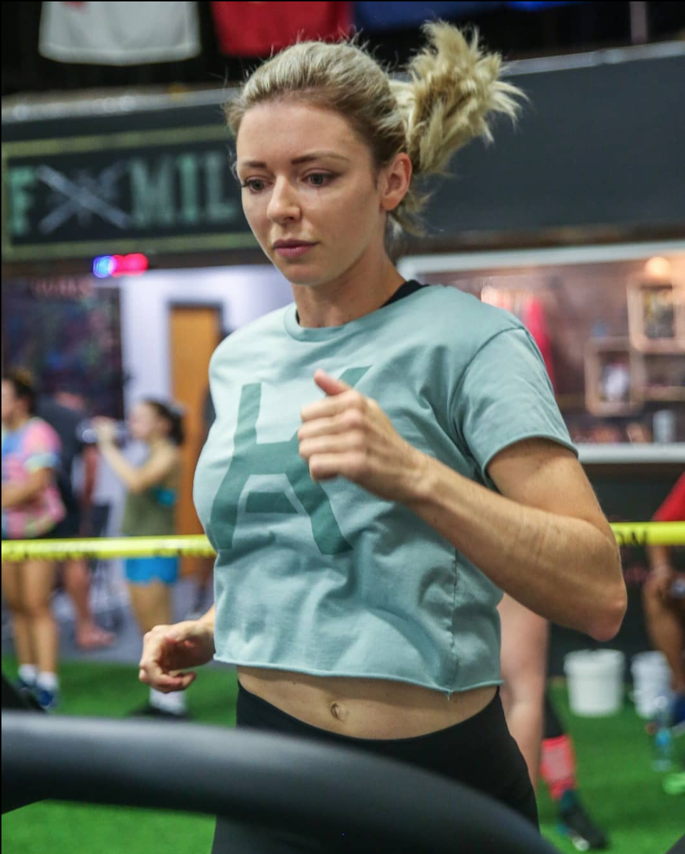
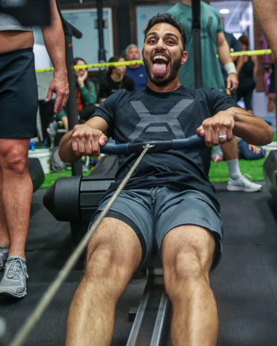
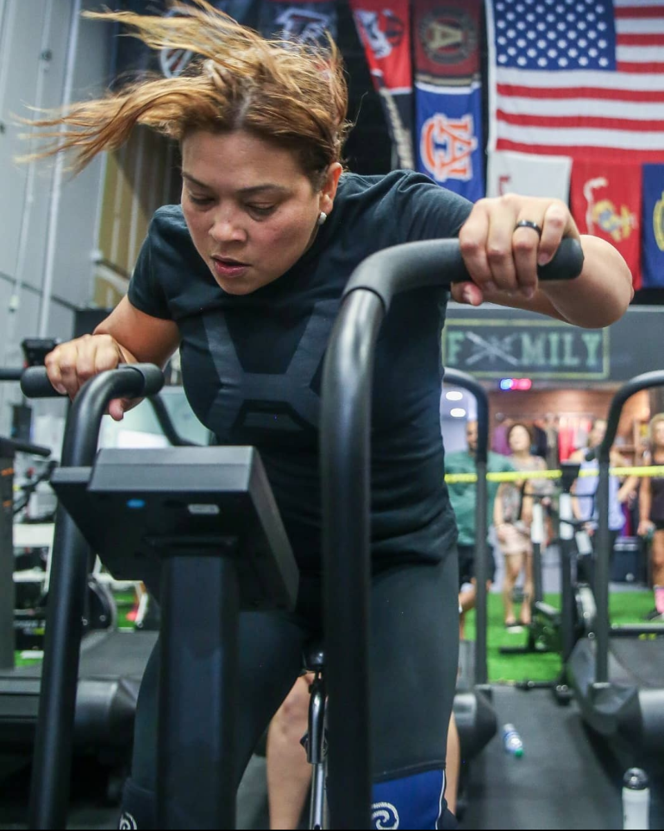
CLIENT: Axiom Athletics (CrossFit AxAt)
OBJECTIVE: Re-design the logo with a more professional, modern feel
APPLICATION: Various print and digital mediums
My clients over at Axiom Athletics in Suwanee, GA reached out to me in order to give their logo a much needed update and refresh.
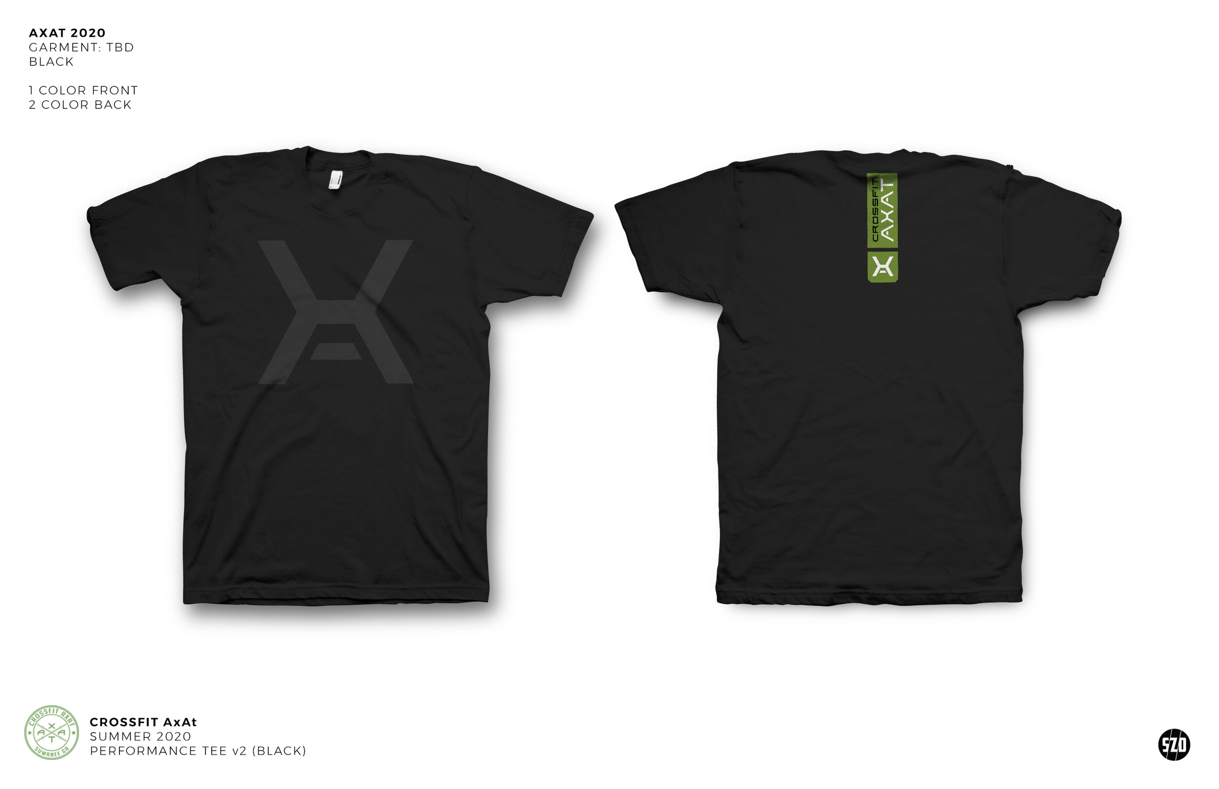
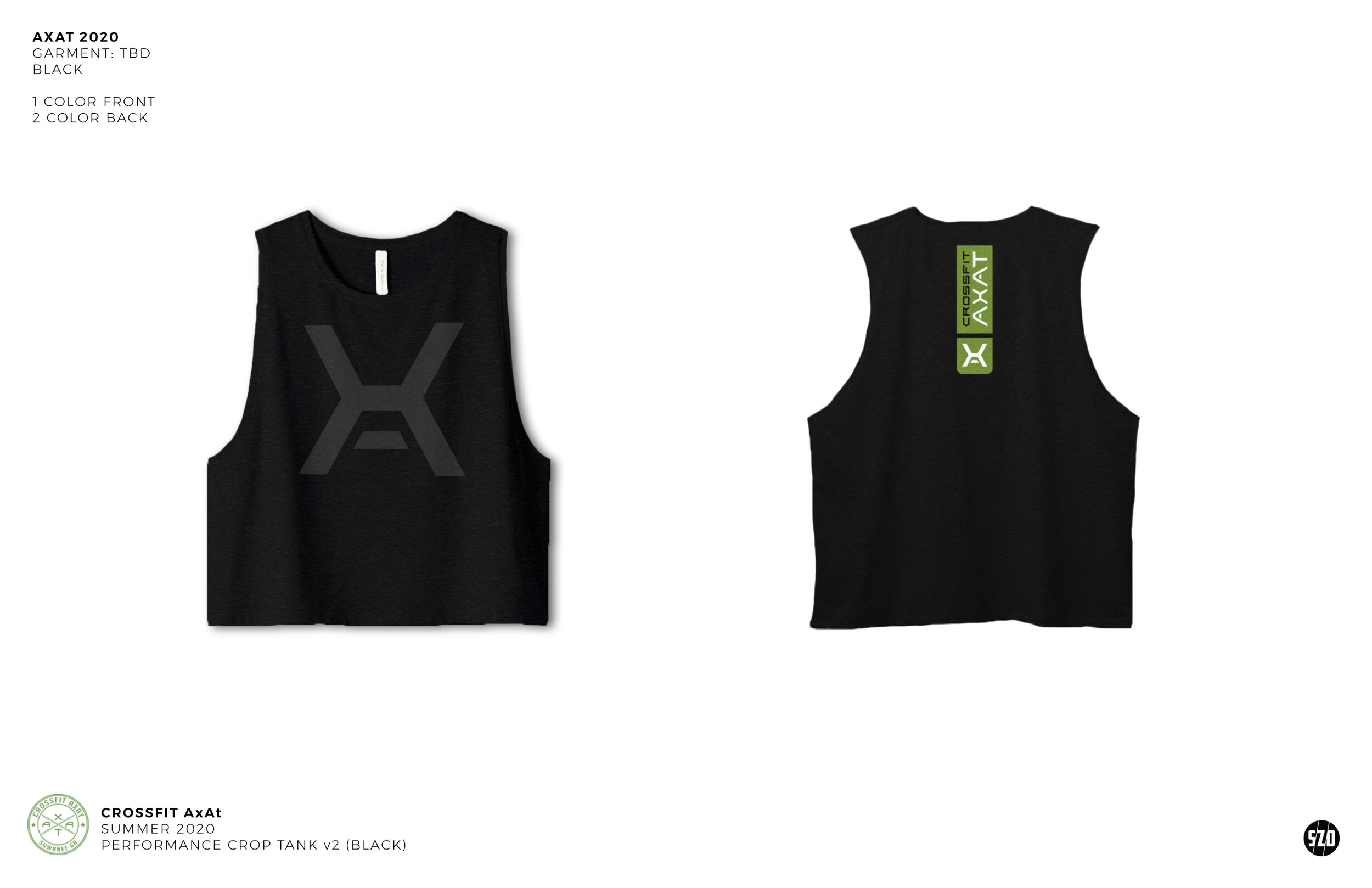
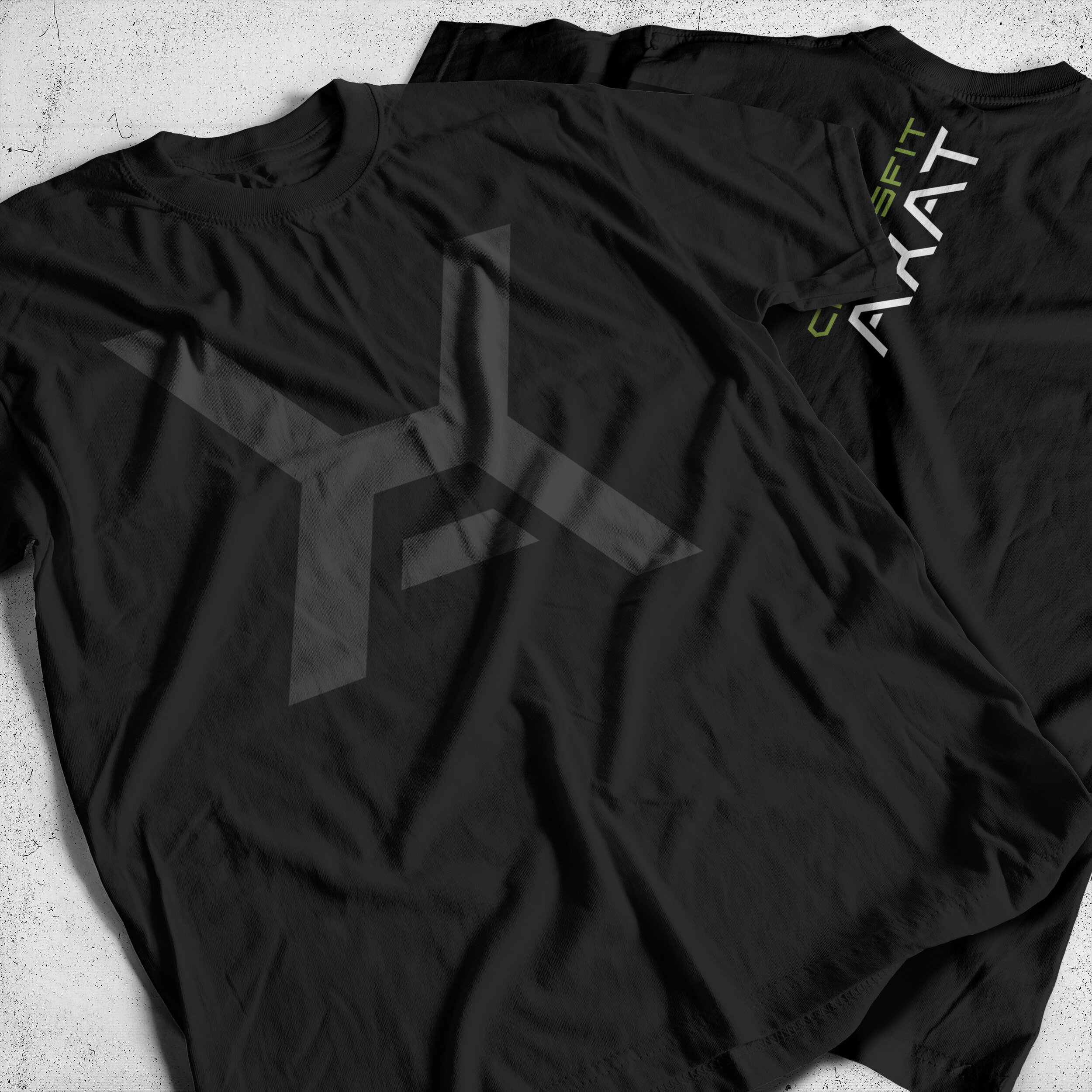
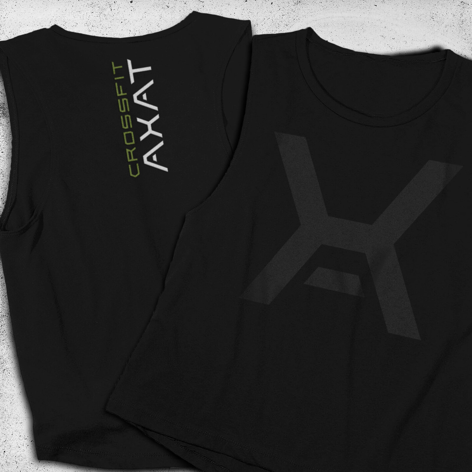
The project initially started with a sample logo that they had worked some time ago which had a rough quality to it and lacked refinement. I began with the main “X'“ icon element of the logo. By adding a floating crossbar I was able to incorporate a stylized “A” into the icon to accompany the "primary “X” design of it; both are letters which feature heavily in Axiom and AxAt’s naming and signage.
Once the icon was approved by Axiom, I then set about creating an alphabet that was defined by the angles and weight of the icon (below). The result was a powerful icon, which, when accompanied by the logotype, presents a strong and uniform logo.


![BrickLookbook[v2].jpg](https://images.squarespace-cdn.com/content/v1/58883b2186e6c0638ec750c7/1513551404349-U8EWI4P6C1J0BHTUCNYY/BrickLookbook%5Bv2%5D.jpg)


![NCposters3[webbanner].jpg](https://images.squarespace-cdn.com/content/v1/58883b2186e6c0638ec750c7/1520087546856-1HLEJPM822V8N6PM9LZ1/NCposters3%5Bwebbanner%5D.jpg)


![2017NCJersey[white]2.jpg](https://images.squarespace-cdn.com/content/v1/58883b2186e6c0638ec750c7/1495606615951-C03XOO9LG9F0Q96ITECR/2017NCJersey%5Bwhite%5D2.jpg)


